HappyPixelsLab Blog
How to Build a High-Converting Landing Page
How to Build a High-Converting Landing Page
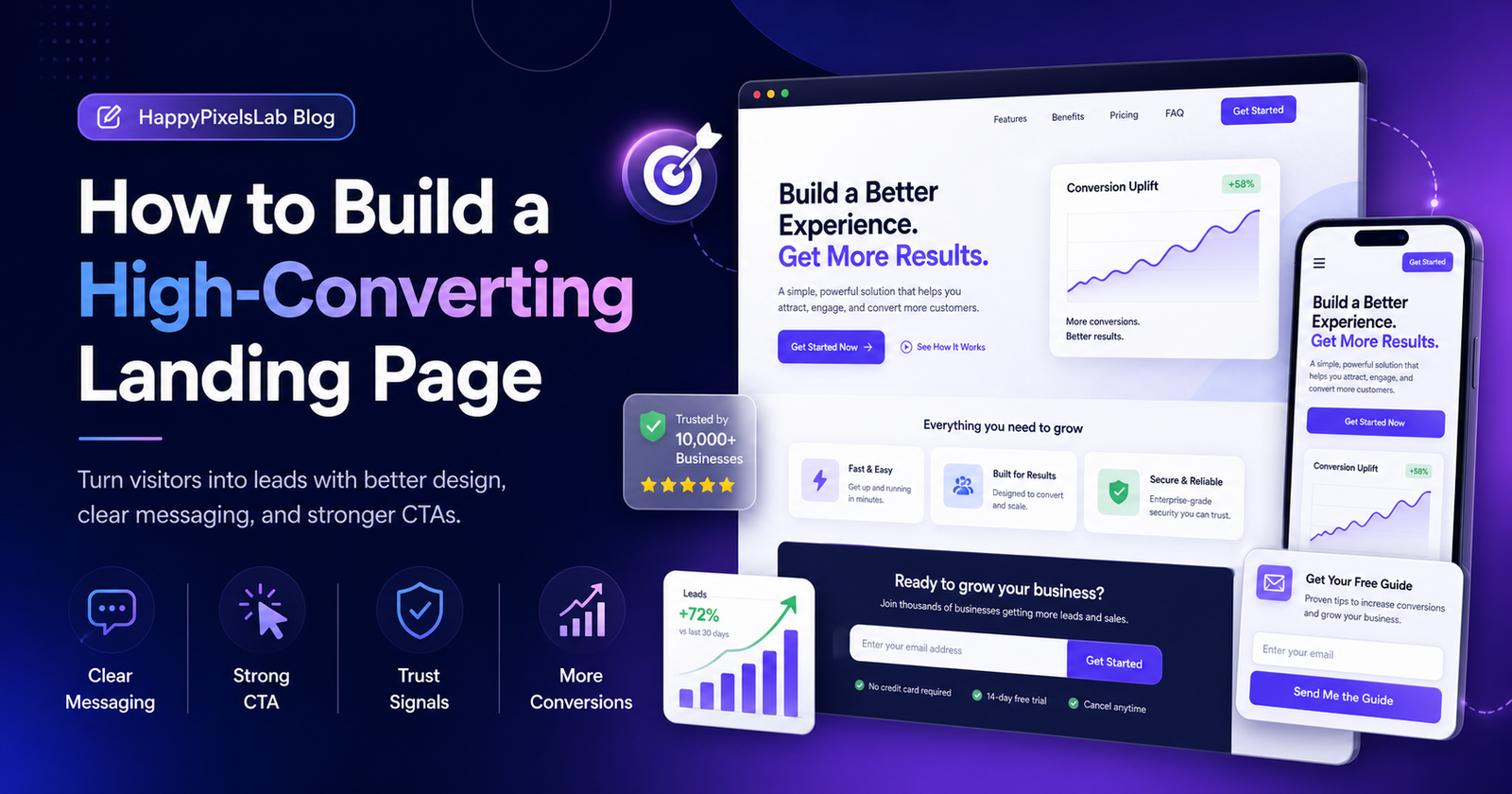
A landing page is one of the most important pages on your website. It is designed with one clear goal: to convert visitors into leads, customers, subscribers, bookings, or inquiries. Unlike a regular website page, a landing page should stay focused on a specific offer, service, product, or campaign.
A high-converting landing page does not depend only on good visuals. It needs the right message, strong layout, clear call-to-action, fast loading speed, mobile-friendly design, trust signals, and a smooth user journey. When all these elements work together, your landing page can turn more visitors into real business opportunities.
At HappyPixelsLab, we design websites and landing pages that focus on clarity, user experience, brand trust, and conversions. In this guide, you will learn how to build a high-converting landing page step by step.
What Is a Landing Page?
A landing page is a focused web page created for a specific marketing goal. Users usually arrive on a landing page from Google Search, social media, ads, email campaigns, WhatsApp links, or promotional posts.
The main purpose of a landing page is to guide the visitor toward one important action. This action can be:
- Submitting an inquiry form
- Booking a consultation
- Buying a product
- Downloading a guide
- Signing up for a newsletter
- Requesting a quote
- Starting a free trial
- Contacting your business on WhatsApp
A normal website page may have multiple links and sections, but a landing page should be more focused and conversion-driven.
Why Landing Page Design Matters for Business Growth
Your landing page can decide whether a visitor becomes a customer or leaves your website. If the page looks confusing, slow, outdated, or untrustworthy, users may not take action.
A well-designed landing page can help your business:
- Generate more leads
- Increase sales and inquiries
- Improve ad campaign performance
- Reduce bounce rate
- Build trust faster
- Explain your offer clearly
- Improve return on marketing investment
For service businesses, startups, agencies, product brands, coaches, and local businesses, a high-converting landing page can become one of the strongest tools for growth.
1. Start with One Clear Goal
The first step in building a high-converting landing page is defining the page goal. A landing page should not try to do everything. It should focus on one primary conversion action.
Before writing content or designing the layout, ask yourself:
- What is the main purpose of this landing page?
- What action should visitors take?
- Who is the target audience?
- What problem are we solving?
- What is the main offer?
For example, if your goal is to generate leads for website design services, the main call-to-action can be “Request a Free Website Consultation” or “Start Your Project.” Avoid adding too many competing actions that distract users from the main goal.
2. Understand Your Target Audience
A landing page converts better when it speaks directly to the right audience. Your message should match the visitor’s needs, pain points, goals, and expectations.
If your target audience is small business owners, your landing page should explain how your service helps them look professional, get more inquiries, and grow online. If your audience is startup founders, the message may focus more on speed, scalability, product launch, and conversion.
To understand your audience, identify:
- Their main problem
- The result they want
- Their common objections
- Their budget expectations
- Their decision-making process
- The language they use while searching online
When your landing page feels relevant, visitors are more likely to stay, read, trust, and take action.
3. Write a Strong Hero Section
The hero section is the first visible area of your landing page. It usually includes the headline, subheading, CTA button, and a supporting visual. This section must quickly explain what you offer and why it matters.
A strong hero section should answer three questions:
- What is this page about?
- How does it help me?
- What should I do next?
For example, instead of writing a vague headline like “We Build Digital Solutions,” use a more specific and benefit-focused headline like:
“Landing Pages That Turn Visitors Into Qualified Leads.”
This type of headline is clearer because it explains the outcome.
4. Make the Headline Clear and Benefit-Driven
Your landing page headline is one of the most important conversion elements. It should be simple, specific, and focused on the benefit users care about.
A good headline should:
- Be easy to understand
- Include the main benefit
- Match the visitor’s search intent
- Create interest without exaggeration
- Connect with the offer clearly
Examples of strong landing page headlines:
- “Get a Professional Website That Helps Your Business Generate More Leads”
- “Launch a High-Converting Landing Page for Your Next Campaign”
- “Turn More Website Visitors Into Customers With Better Design”
- “Build Trust Online With a Fast, Modern, Conversion-Focused Website”
A headline should not be written only for search engines. It should be written for real people who need a clear reason to continue reading.
5. Add a Persuasive Subheading
The subheading supports your headline by giving a little more detail. It should explain who the page is for, what problem you solve, and what result users can expect.
Example:
Headline: Build a Landing Page That Converts More Visitors Into Leads
Subheading: We design fast, mobile-friendly, and conversion-focused landing pages for service businesses, startups, and brands that want better results from their traffic.
The subheading should be short, helpful, and easy to scan.
6. Use One Strong Call-to-Action
A call-to-action, or CTA, tells users what to do next. It can be a button, form, WhatsApp link, phone call button, or booking link.
Examples of good CTA text:
- Start Your Project
- Request a Free Quote
- Book a Free Consultation
- Get Landing Page Design Help
- Contact Us on WhatsApp
- Download the Free Guide
Avoid generic CTA text like “Submit” or “Click Here” when possible. Strong CTA text should remind the visitor what they will get after clicking.
Also make sure your CTA button is visible, readable, and repeated in important sections of the page.
7. Keep the Landing Page Layout Simple
A high-converting landing page should guide users smoothly from problem to solution to action. The layout should not feel crowded or confusing.
A simple landing page structure can include:
- Hero section with headline and CTA
- Problem or pain point section
- Solution or service explanation
- Benefits section
- Process section
- Testimonials or trust signals
- Pricing or package details if relevant
- FAQ section
- Final CTA section
Every section should move the visitor closer to the main action.
8. Focus on Benefits, Not Only Features
Many landing pages only list features. Features are important, but benefits explain why those features matter to the user.
For example:
- Feature: Mobile-responsive design
- Benefit: Your page looks professional and works smoothly on every device
- Feature: Fast loading speed
- Benefit: Visitors are less likely to leave before taking action
- Feature: Clear CTA section
- Benefit: Users know exactly how to contact your business
Benefits help visitors understand the real value of your offer.
9. Build Trust with Social Proof
People are more likely to take action when they trust your business. Social proof helps reduce doubt and makes your landing page more credible.
You can add social proof using:
- Client testimonials
- Google reviews
- Case studies
- Before-and-after results
- Portfolio examples
- Client logos
- Ratings
- Project numbers
- Real screenshots or results
If you are a new business, you can still build trust with clear process details, transparent communication, strong design quality, FAQs, and professional contact information.
10. Use High-Quality Visuals
Visuals help users understand your offer faster. A landing page can use images, mockups, icons, illustrations, product screenshots, service graphics, or short videos.
Good visuals should support the message. Avoid using random stock images that do not explain the service or product.
For a landing page design service, useful visuals can include:
- Website mockups
- Landing page wireframes
- Conversion flow diagrams
- Before-and-after design examples
- Mobile and desktop preview screens
- Lead generation dashboard visuals
Use compressed images so the page remains fast. Also add descriptive alt text for accessibility and image SEO.
11. Make the Page Mobile-Friendly
Most users browse websites from mobile devices. A landing page that looks good only on desktop can lose many potential leads.
A mobile-friendly landing page should have:
- Readable text
- Large tap-friendly buttons
- Fast loading images
- Simple navigation
- Short sections
- Easy-to-fill forms
- Sticky CTA or WhatsApp button when useful
Always test your landing page on different screen sizes before publishing.
12. Keep Forms Short and Easy
Forms are one of the most important parts of a lead generation landing page. If the form is too long or confusing, users may leave without submitting it.
For most landing pages, ask only for the information you truly need.
A simple lead form can include:
- Name
- Email address
- Phone number
- Business name
- Service required
- Short project message
You can also use a WhatsApp CTA for users who prefer quick communication. For Indian service businesses, WhatsApp contact buttons can improve inquiry flow when used clearly and professionally.
13. Use Clear Copywriting
Landing page copy should be simple, direct, and persuasive. Avoid complicated words, long paragraphs, and unclear promises.
Good landing page copy should:
- Explain the offer clearly
- Highlight the main benefit
- Address user pain points
- Answer common objections
- Use short paragraphs
- Make the CTA feel natural
Write like you are helping the visitor make a confident decision.
14. Add an FAQ Section
An FAQ section helps answer common questions before users contact you. It can also reduce hesitation and improve the overall user experience.
Useful landing page FAQ questions include:
- How long does it take to build a landing page?
- Will the landing page be mobile-friendly?
- Can you write the landing page content?
- Can you connect the form with email or WhatsApp?
- Can you redesign my existing landing page?
- Do you provide SEO-friendly landing page design?
Answer each question clearly and honestly.
15. Improve Loading Speed
Page speed directly affects user experience. If your landing page takes too long to load, visitors may leave before seeing your offer.
To improve landing page speed:
- Compress images
- Use modern image formats like WebP
- Minimize unnecessary scripts
- Avoid heavy animations
- Use clean code
- Optimize fonts
- Use caching when possible
A fast landing page feels more professional and can support better campaign performance.
16. Remove Distractions
A landing page should keep users focused on the main conversion goal. Too many links, popups, animations, menu items, or unrelated sections can reduce conversions.
To reduce distractions:
- Limit unnecessary navigation links
- Keep the design clean
- Use one main CTA
- Avoid unrelated offers
- Remove confusing design elements
- Keep the message consistent
The easier the decision feels, the more likely users are to take action.
17. Use Analytics and Conversion Tracking
After publishing your landing page, you should track how users interact with it. Analytics helps you understand what is working and what needs improvement.
Important landing page metrics include:
- Page visits
- Bounce rate
- Form submissions
- CTA clicks
- WhatsApp clicks
- Scroll depth
- Conversion rate
- Traffic sources
You can use tools like Google Analytics, Google Search Console, Meta Pixel, or Google Ads conversion tracking depending on your marketing setup.
18. Test and Improve Continuously
A landing page is never truly finished. You can improve performance by testing different headlines, CTA text, form length, visuals, section order, testimonials, and offers.
Common landing page elements to test include:
- Hero headline
- CTA button text
- Button placement
- Form fields
- Testimonials
- Pricing section
- Hero image
- FAQ section
Small changes can sometimes create a big difference in conversions.
High-Converting Landing Page Checklist
Before publishing your landing page, use this checklist:
- Is the page focused on one clear goal?
- Is the headline clear and benefit-driven?
- Is the CTA visible above the fold?
- Does the page explain the problem and solution?
- Are the benefits easy to understand?
- Is the design mobile-friendly?
- Are forms short and simple?
- Does the page include trust signals?
- Are images compressed and relevant?
- Is the page loading quickly?
- Does the content answer common objections?
- Is conversion tracking enabled?
- Is the final CTA strong and clear?
Common Landing Page Mistakes to Avoid
Many landing pages fail because they try to look attractive without focusing on user behavior and conversion strategy.
Avoid these common mistakes:
- Using a vague headline
- Adding too many CTAs
- Making the form too long
- Using slow and heavy images
- Not optimizing for mobile users
- Using weak or generic copy
- Hiding important information
- Not adding testimonials or trust signals
- Sending ad traffic to a normal homepage
- Not tracking conversions
A high-converting landing page should be simple, focused, trustworthy, and easy to act on.
How HappyPixelsLab Can Help You Build Better Landing Pages
At HappyPixelsLab, we create modern, professional, and conversion-focused landing pages for businesses that want better results from their online presence.
Our landing page design approach includes:
- Clear conversion strategy
- Modern UI/UX design
- Mobile-first layout
- Fast-loading page structure
- SEO-friendly content layout
- Strong CTA sections
- Lead generation form design
- WhatsApp and contact integration
- Trust-building sections
- Analytics and conversion tracking support
Whether you need a landing page for a service, product, campaign, startup, ad funnel, or lead generation system, a well-designed landing page can help you convert more visitors into real business inquiries.
Final Thoughts
A high-converting landing page is not just a beautiful page. It is a focused business tool that combines strategy, design, copywriting, trust, speed, and user experience.
To build a landing page that converts, start with one clear goal, understand your audience, write a strong headline, use persuasive content, add trust elements, optimize for mobile, and track your results after launch.
If your website is getting traffic but not enough leads, your landing page may need better design, clearer messaging, and stronger conversion flow.
Need a high-converting landing page for your business? HappyPixelsLab can help you design a fast, modern, and conversion-focused landing page that turns visitors into leads and customers.
Contact HappyPixelsLab today and let’s build a landing page that helps your business grow.
Frequently Asked Questions About High-Converting Landing Pages
What is a high-converting landing page?
A high-converting landing page is a focused web page designed to turn visitors into leads, customers, subscribers, bookings, or inquiries. It uses clear messaging, strong call-to-action buttons, trust elements, mobile-friendly design, and a simple layout to guide users toward one specific action.
Why is a landing page important for business growth?
A landing page helps businesses convert website traffic into real results. Instead of sending users to a general homepage, a landing page focuses on one service, product, offer, or campaign. This makes it easier for visitors to understand the value and take action.
What should be included on a landing page?
A good landing page should include a clear headline, benefit-focused subheading, strong CTA button, service or product details, trust signals, testimonials, simple lead form, mobile-friendly design, FAQ section, and final call-to-action.
How do I make my landing page convert better?
To improve landing page conversions, use a clear headline, remove distractions, keep forms short, add testimonials, improve loading speed, use strong CTA buttons, optimize for mobile users, and track user actions with analytics.
How long should a landing page be?
A landing page should be as long as needed to explain the offer clearly and answer user questions. For simple offers, a short landing page may work well. For expensive services, detailed products, or business offers, a longer page with benefits, process, proof, FAQs, and trust elements can perform better.
What is the best CTA for a landing page?
The best CTA depends on your goal. For service businesses, strong CTA examples include “Request a Free Quote,” “Book a Free Consultation,” “Start Your Project,” “Get Landing Page Design Help,” and “Contact Us on WhatsApp.” The CTA should be clear, action-focused, and connected to the value users will receive.
Why is mobile-friendly design important for landing pages?
Many users visit websites from mobile devices. If your landing page is difficult to read, slow to load, or hard to use on mobile, visitors may leave without taking action. A mobile-friendly landing page improves user experience and helps generate more leads from mobile traffic.
Can a landing page help with SEO?
Yes, a landing page can support SEO when it has helpful content, clear headings, relevant keywords, fast loading speed, optimized images, internal links, and a search-friendly structure. However, the page should be written for real users first, not only for search engines.
What are common landing page mistakes?
Common landing page mistakes include using a vague headline, adding too many CTAs, using long forms, ignoring mobile design, using slow images, not adding trust signals, hiding important information, and not tracking conversions.
How can HappyPixelsLab help with landing page design?
HappyPixelsLab can help you design modern, fast, mobile-friendly, and conversion-focused landing pages for services, products, campaigns, startups, and lead generation. We focus on clear messaging, strong UI/UX, trust-building sections, CTA flow, and business-focused design.